Part 03
Give Visual Context
Design is visual, feed Claude visuals. This single habit improves results more than any clever wording.
Description
Design is visual, feed Claude visuals. This single habit improves results more than any clever wording.
Terms
Paste a screenshot
Drop in a screen of what exists. Claude can read layout, hierarchy, and problems directly.
Here's the current screen [image]. What's hurting the hierarchy?
"Match this" reference
Share an example you like and name what about it to borrow, don't assume Claude guesses the right part.
Match the spacing and restraint of this [image], but use our colors.
Describe the brand
Give adjectives + anti-adjectives. "Warm and trustworthy, not corporate or cold" steers fast.
Brand feel: calm, precise, a little technical. Not flashy, not cute.
Share tokens / specs
Paste your actual colors, type scale, spacing. Claude will design within your system, not invent one.
Use these tokens: primary #6D28D9, radius 12px, 8px spacing scale, Inter.
Point at a Figma file
With the Figma connector, share a frame link so Claude reads the real design, not a description.
Here's the frame: [figma link]. Implement it as a React component.
Name the device frame
Specify viewport so layout decisions are correct from the start.
Design for 390×844 (iPhone), then show the desktop breakpoint.
Part 05
Design Systems & Tokens
Speak in systems and Claude produces consistent, scalable work instead of one-off pixels.
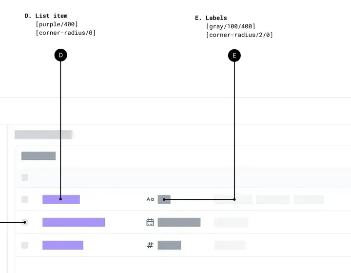
- 1A part’s spec: a named colour step and radius
- 2The part it describes, on the screen
- 3Tokens: a named grey, a named radius
- 4Labels in that grey
A table drawn as parts, by hand: each part has a name, a colour step and a corner radius.
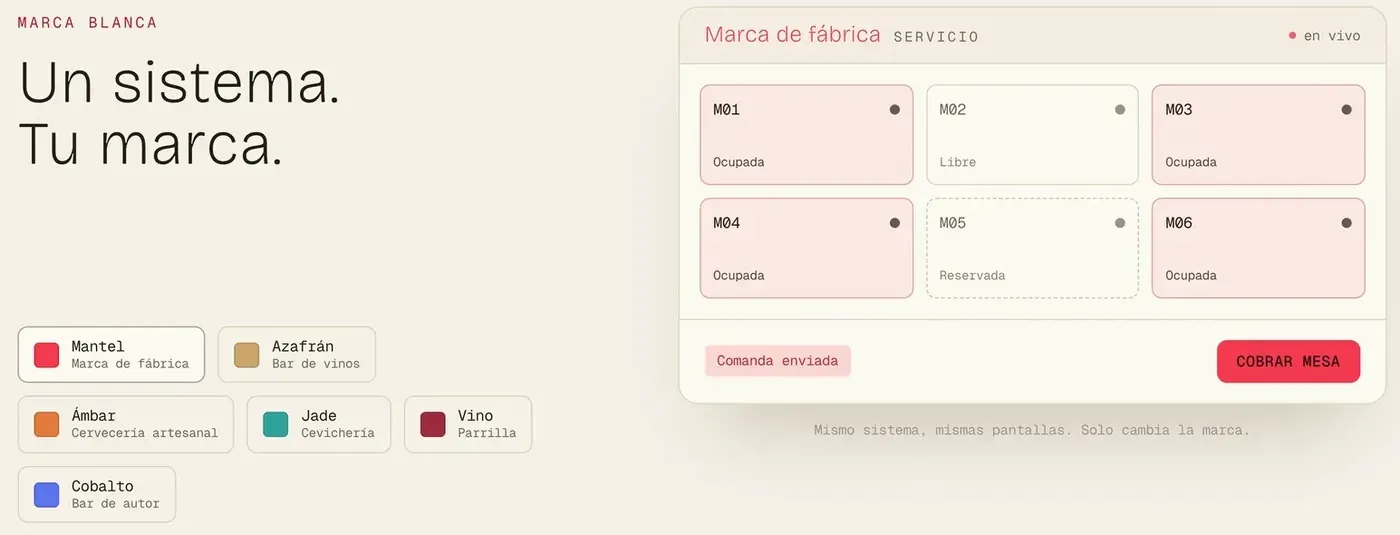
- 1One token set per brand
- 2The primary colour, from the token
- 3A tint of the same accent
- 4A state: reserved, dashed
One screen, and the brands it can be dressed in. The layout never changes; only the named values do.
Description
Speak in systems and Claude produces consistent, scalable work instead of one-off pixels.
Terms
"Define tokens first"
Ask Claude to establish color, type, spacing, and radius tokens before any screens.
Define a token set (color, type scale, spacing, radius) before designing screens.
"Componentize this"
Turn a repeated pattern into a reusable component with named props and variants.
Componentize the card: props for image, title, badge, and a hover state.
"Use semantic naming"
Ask for role-based names (primary, surface, danger) over literal ones (blue, gray-2).
Name colors semantically: primary, surface, danger, not by hue.
"Document usage"
Have Claude write do/don't guidance so the system is usable by others.
For each component, add when to use / when not to use.
"Audit for consistency"
Point Claude at existing screens to find drift, off-scale spacing, stray colors, mixed radii.
Audit these screens for tokens that break the system.
"Theme it"
Ask for the same components driven by tokens so light/dark or brand themes swap cleanly.
Make it themeable, one token set drives light and dark.