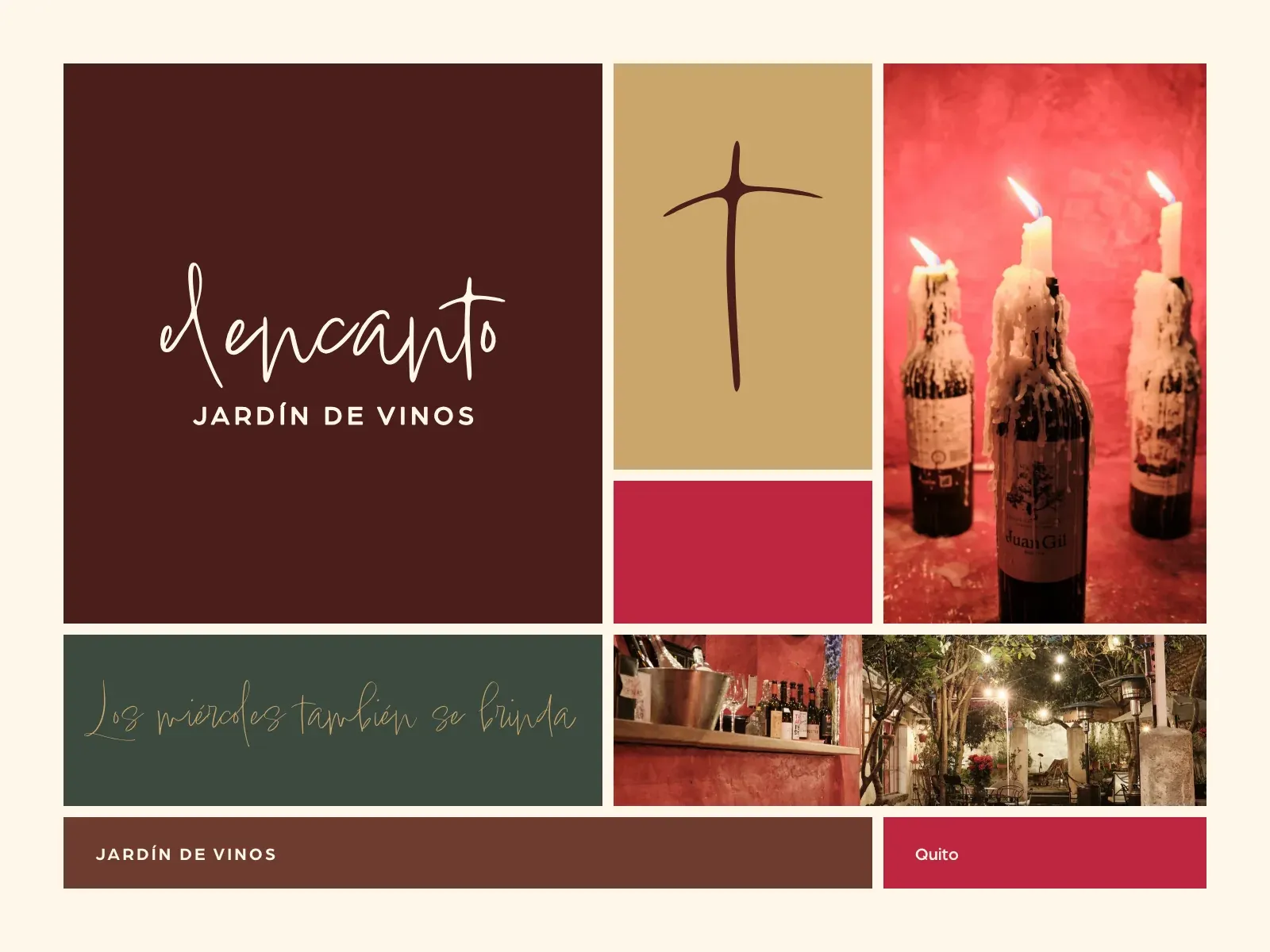
The brand board: the wordmark, the symbol and Lindsey on the colours, with photographs of the house.
The place
Behind a wooden door, a garden in the middle of a 250-year-old house: wine first, then the food that goes with it. A full engagement: name, brand, strategy, the website, menus, signage and the little things that touch a guest, social media, photography, and the operations app the team runs service on.
The courtyard at night, lit by two hanging lanterns against yellow walls.; A red wall with a bar shelf of bottles, and the garden behind it under string lights.; A dark corridor with red walls and candles on a table in the foreground.
The house: the courtyard, the bar and the garden, a corridor.
The strategy
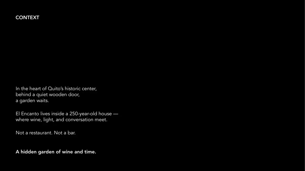
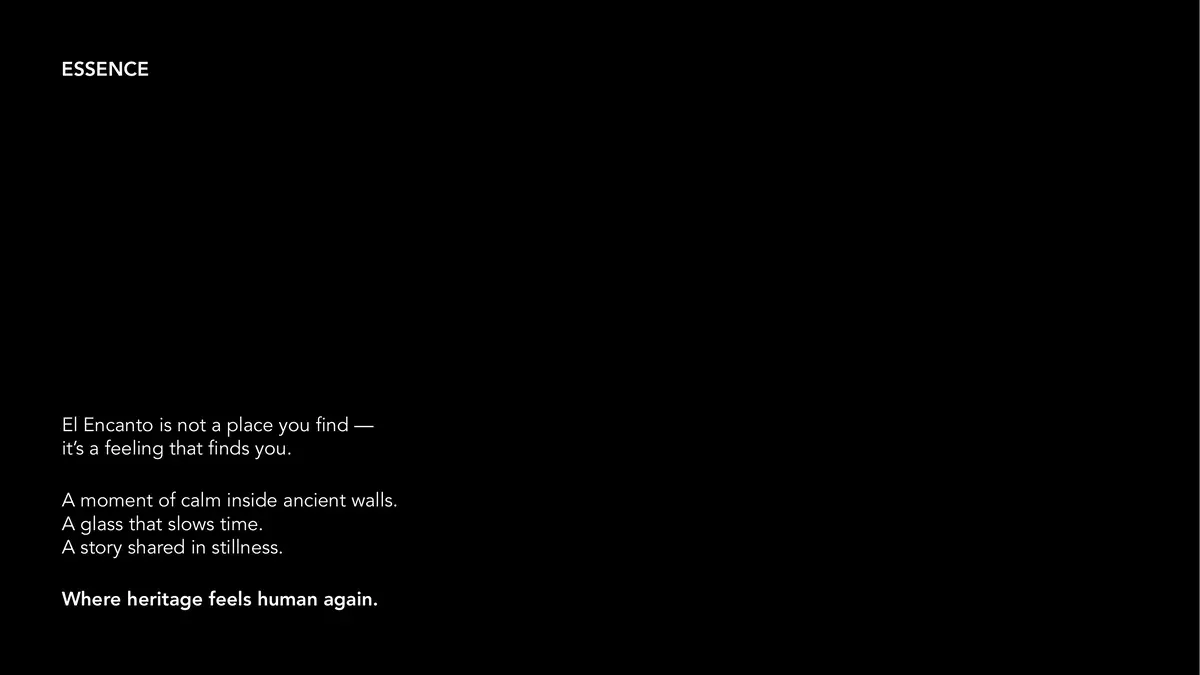
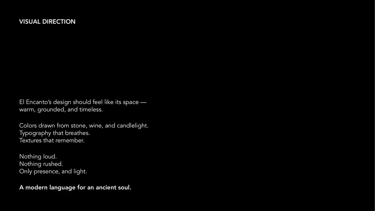
Before any drawing, a strategy deck. It found two extremes in how Quito presents wine, food and heritage, formality and familiarity, and put El Encanto in the middle: “warmth without pretense, sophistication without distance.”
A black deck page titled Context: a garden behind a quiet wooden door, inside a 250-year-old house.; A black deck page titled Essence: a moment of calm inside ancient walls.; A black deck page titled Visual direction: colours drawn from stone, wine and candlelight.
Three pages from the strategy deck: context, essence, visual direction.
Exploring the mark
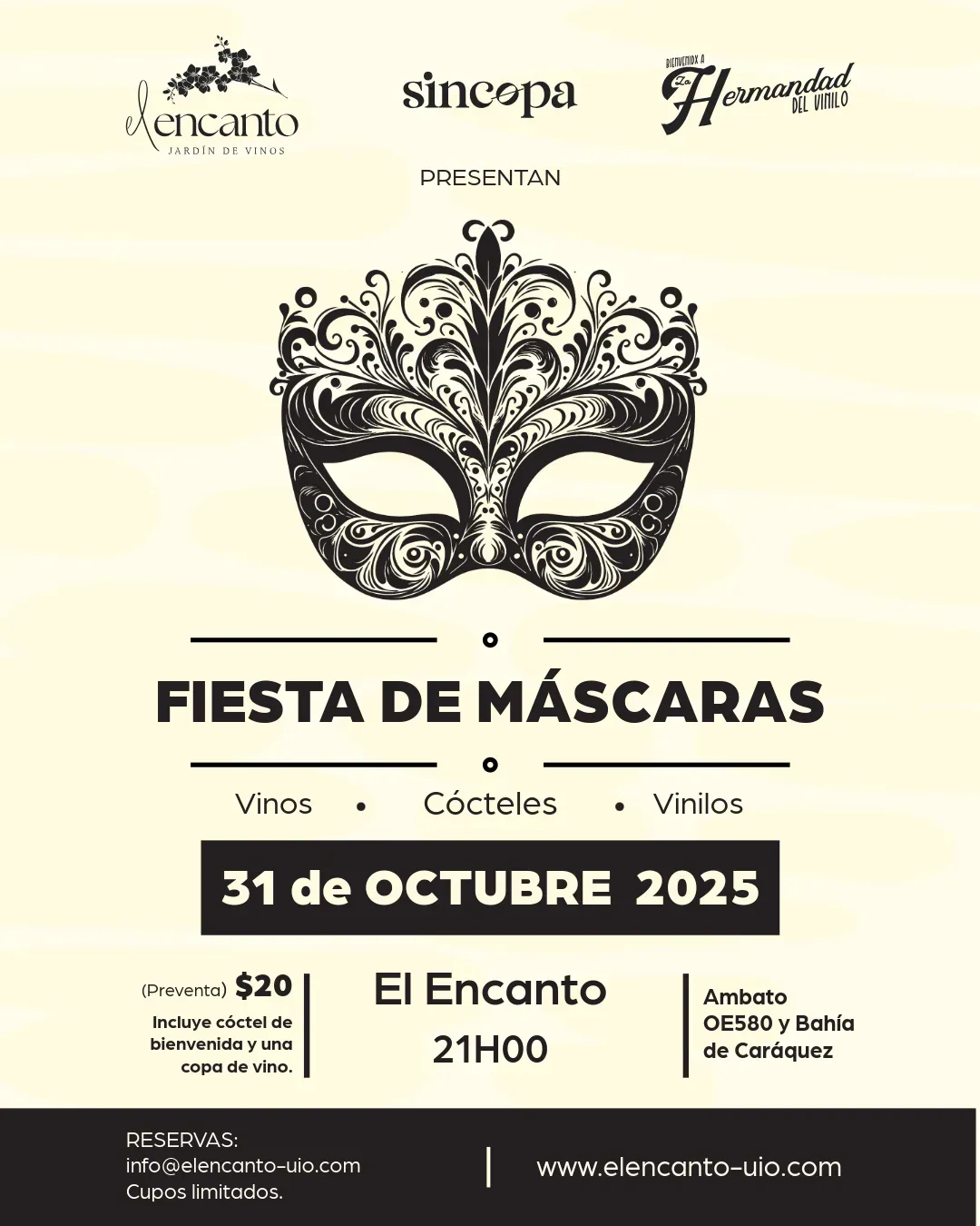
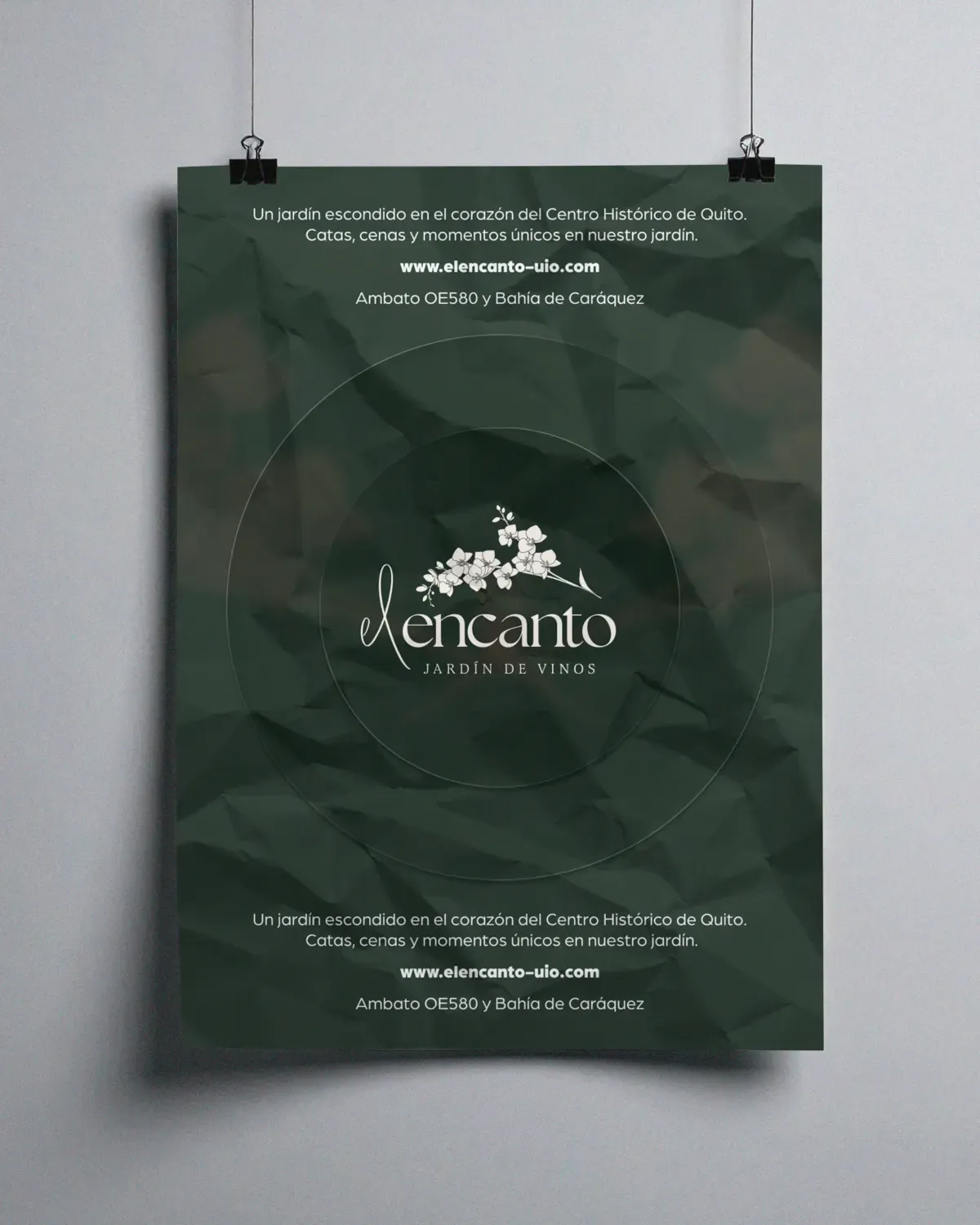
The first round went wide: seventeen directions, from stacked serifs to a script with an orchid over it. The orchid script went forward and carried the first posts and posters.
An event post on cream: a black lace mask, FIESTA DE MÁSCARAS, 31 de octubre 2025, with the orchid logo at the top.; A poster hanging on a grey wall: the orchid wordmark in cream on crumpled dark green paper.
The first generation in use: an event post, and a poster (mockup).
The mark
The identity then moved to a hand-lettered script. Its “t” stands up as a cross, and on its own it is the symbol, at the top of the website and the menu.
The wordmark, and its “t” as the symbol.
Brown on beige
Beige on deep brown
Beige on red
Beige on grass
Deep brown on gold
The symbol alone
Colourways from the palette.
Colour
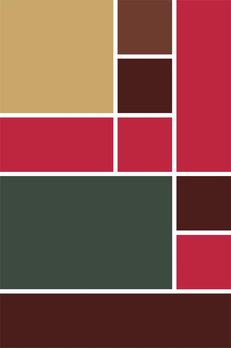
Six colours from the house: browns and grass green for the room, gold and beige for candlelight, red as the accent. Stacked into a grid of blocks, they make a pattern the brand paints and prints.
Deep brown #4A1F1AThe room. Type, the wordmark.
Brown #6E3C30The room. Wood, walls.
Grass #3D4A40The garden.
Gold #C9A66BCandlelight.
Beige #FFF6EACandlelight. Paper, grounds.
Red #BE2641The accent.
The block grid.
Type
Arboria in two weights for the words, Lindsey for the handwritten touches: a special on a post, a flourish on a card.
Arboria Black
Arboria Book
Lindsey
Outlined from the fonts. The Lindsey line is from a post.
The painted world
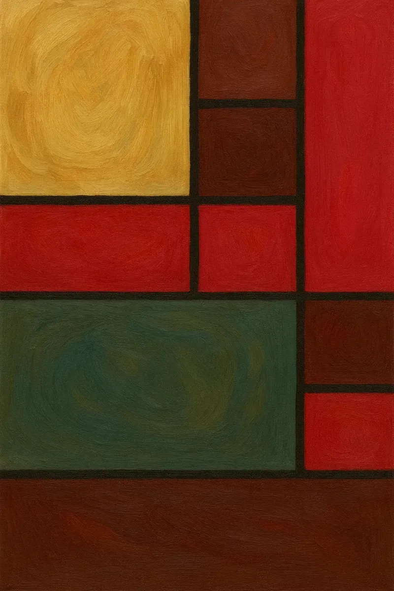
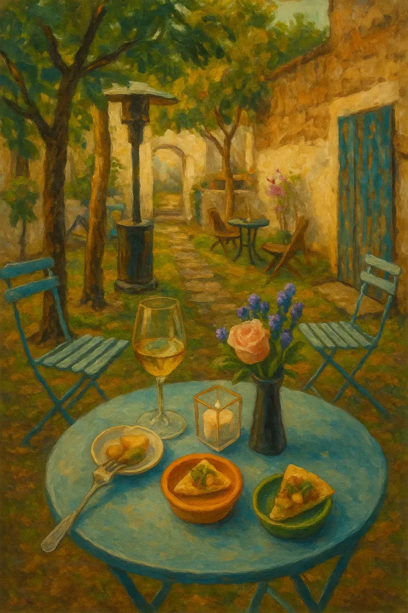
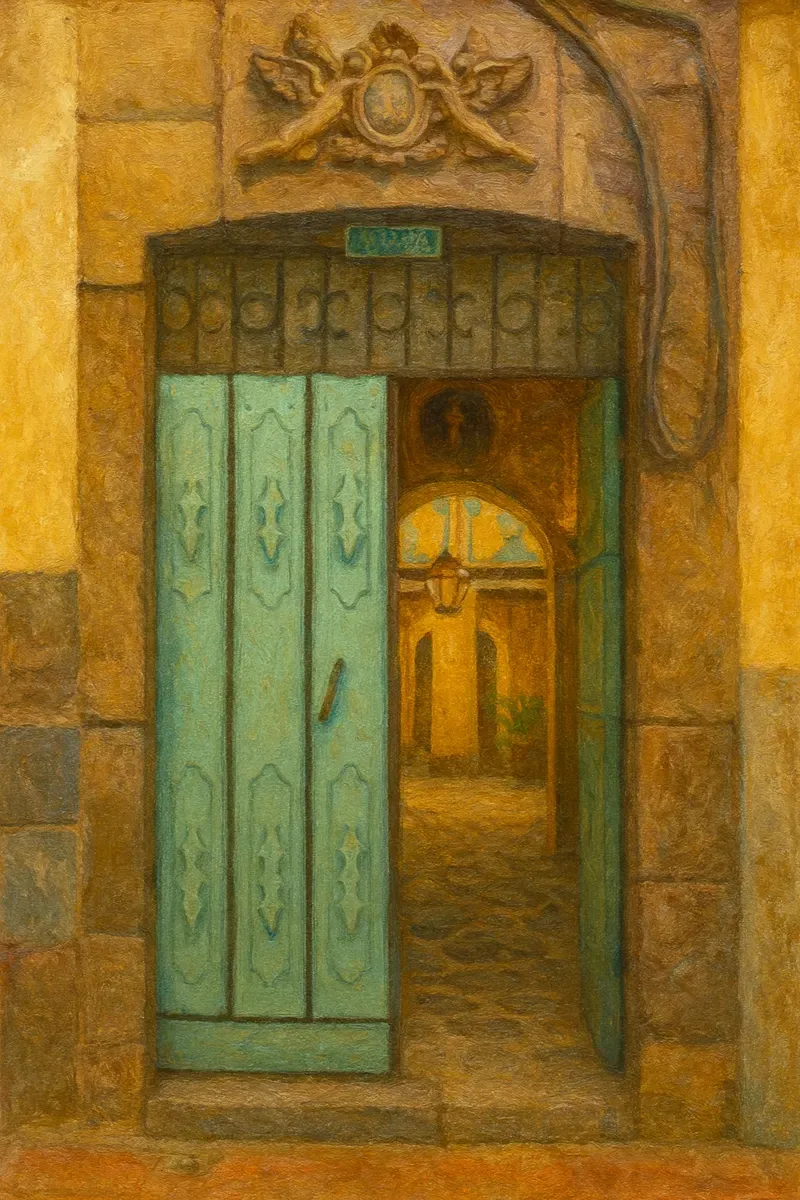
For posts and the website, oil paintings in the brand’s colours.
The block grid painted in oils: gold, red, brown and green rectangles.; An oil painting of a garden table with wine glasses and plates under trees.; An oil painting of a green carved wooden door opening onto a stone passage.
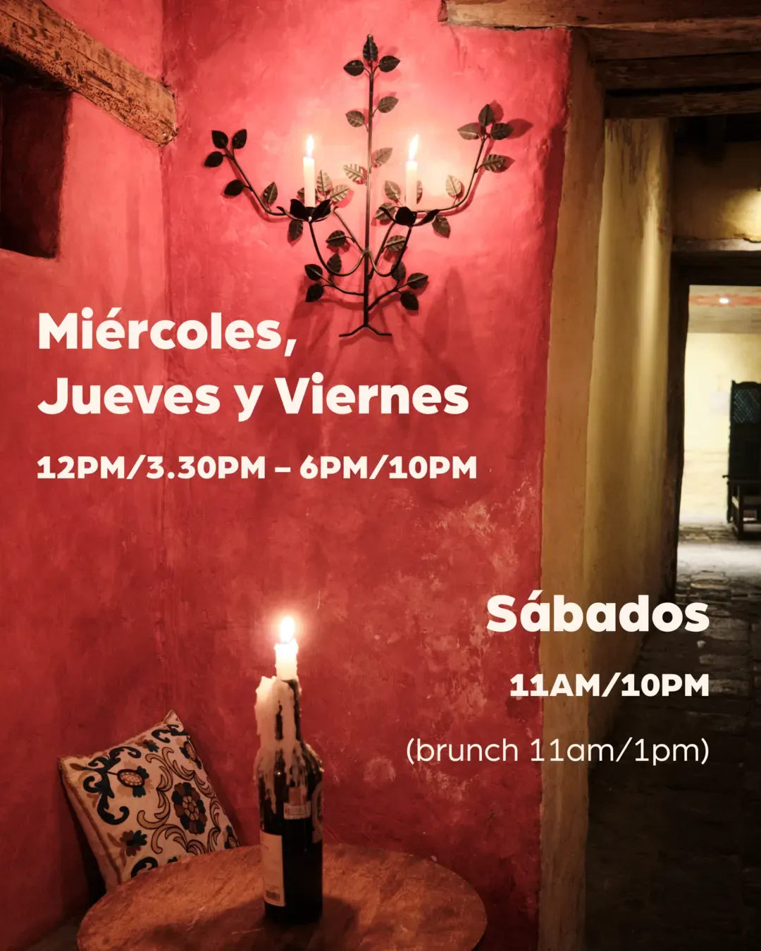
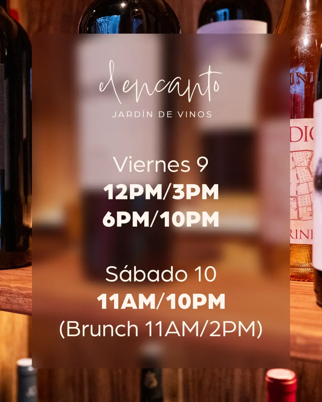
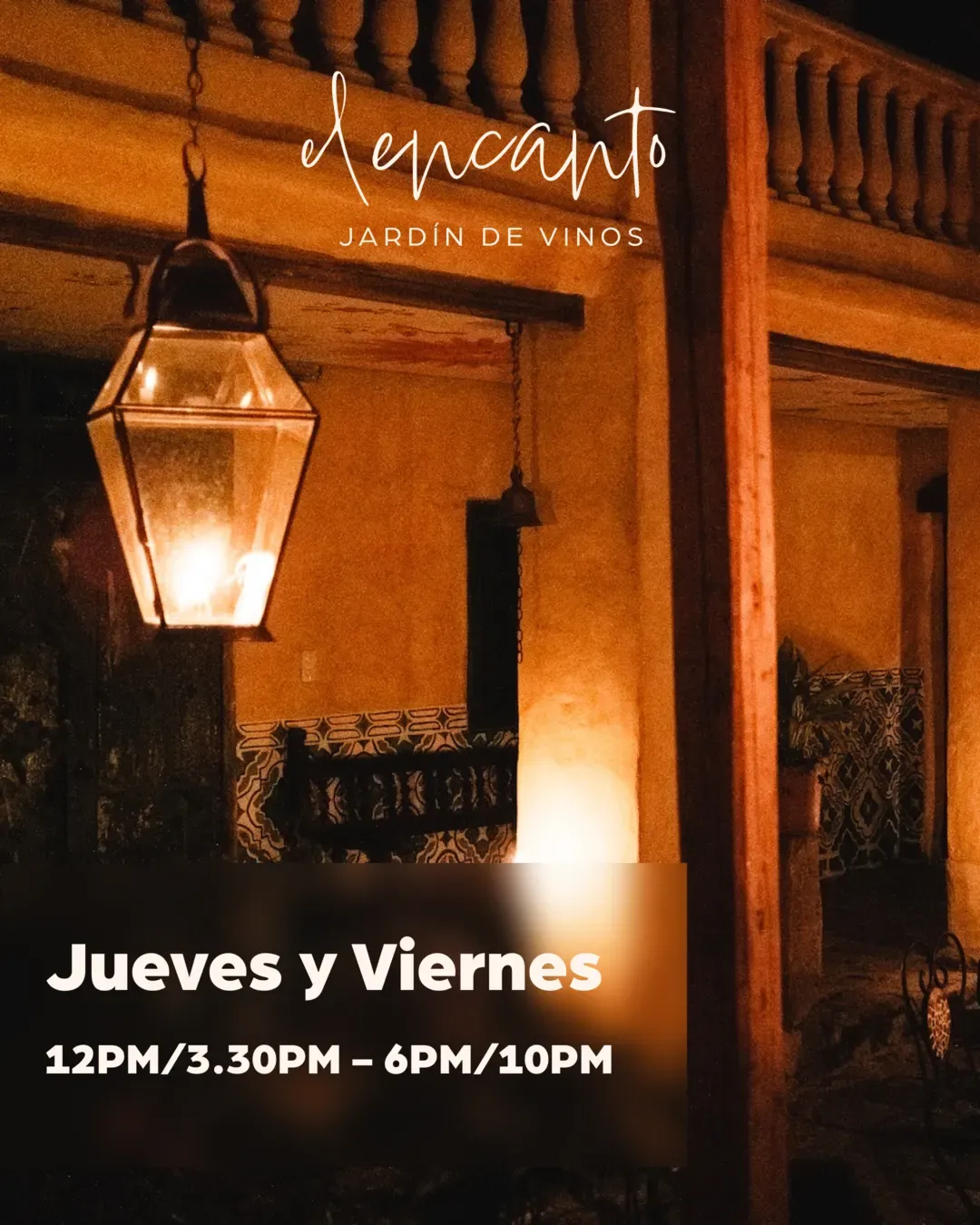
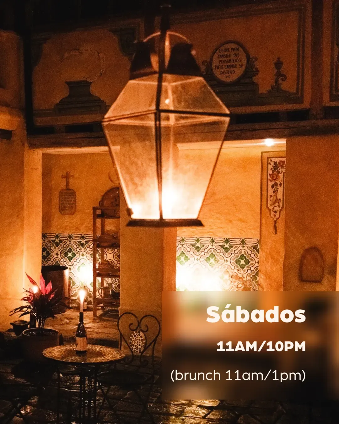
A post: candles on a red wall, the opening hours in white Arboria.; A post: wine bottles behind a frosted panel with the wordmark and the weekend hours.; A post: a lantern in the courtyard at night, Jueves y Viernes with the hours.; A post: a lantern over a table in the courtyard, Sábados with the hours.
Posts.
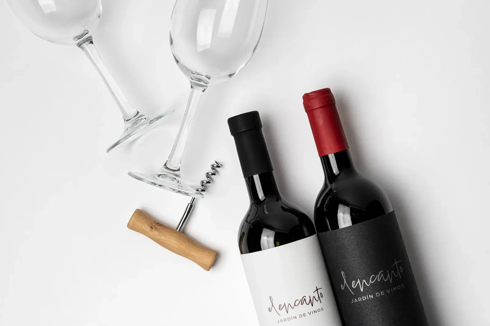
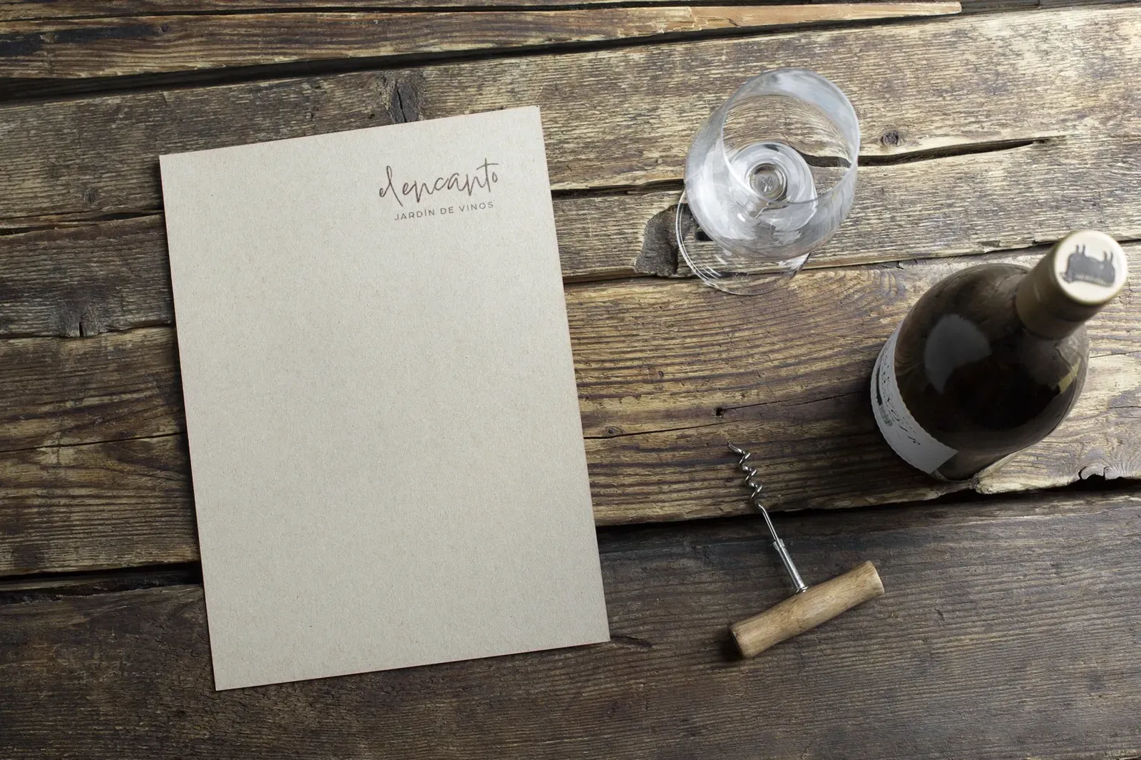
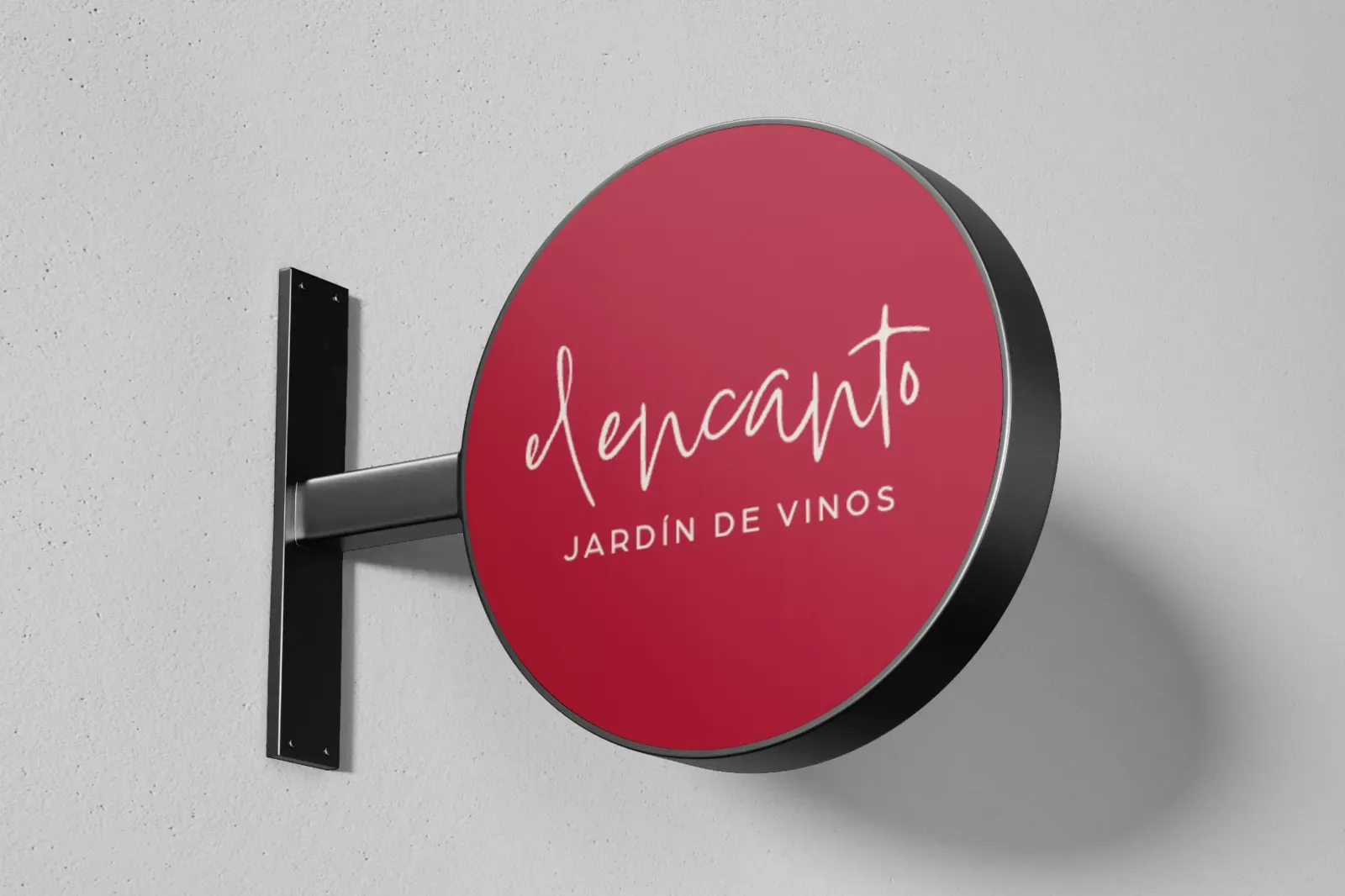
Two wine bottles with white and black labels carrying the script wordmark, beside two glasses and a corkscrew.; A paper menu card with the wordmark on a wooden table beside a wine bottle and a glass.; A round hanging sign in red with the script wordmark in beige.
Wine labels, a menu card, the sign in red. Mockups.
The website and the app
The website and its QR menu ship from the same codebase as the operations app; its white-label version is Mantel. The brand and the site are live, and the app runs the room every service.
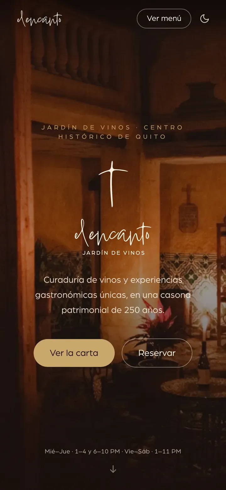
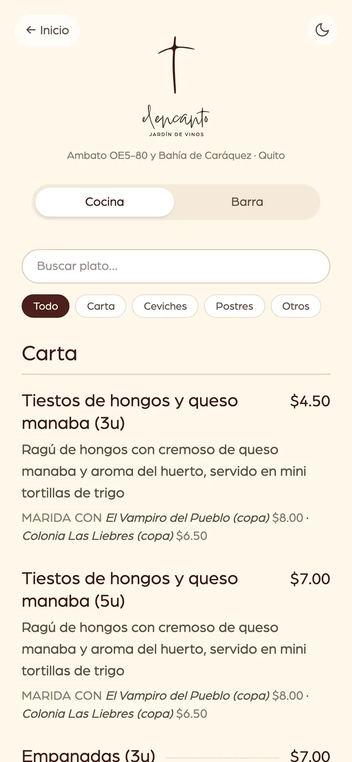
The website home on a phone: the symbol and wordmark over a photo of the house, with buttons for the menu and reservations.; The QR menu on a phone: the symbol at the top, kitchen and bar tabs, dishes with prices and wine pairings.; The app's order entry screen on a phone.; The app's kitchen display screen on a phone.
The site’s home and menu, the app’s orders and kitchen.