On the record · 2021 to 2025 · Huridocs
The Uwazi refactor
Eighteen months rebuilding the interface of a platform used by 150+ organizations, without stopping the work it carries.
- When
- 2021 to 2025
- For
- Huridocs
Forty screens
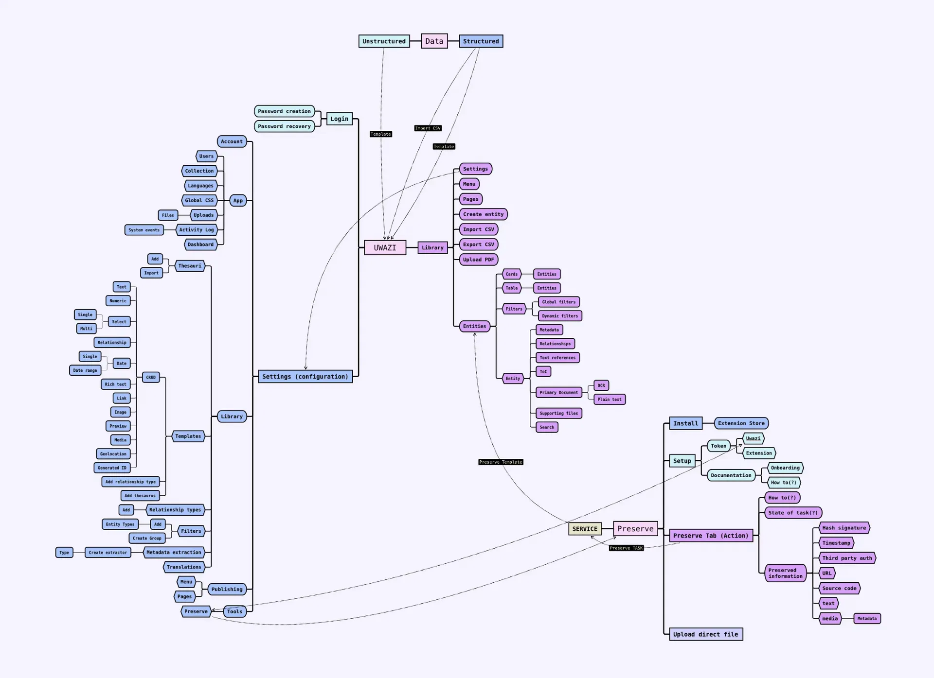
Nothing in Uwazi was badly designed. Every screen in it had been a sensible answer to a real request from a real organization, shipped by people who cared. The problem was that there were years of those, made by different hands at different times, and none of them had been made in reference to each other.
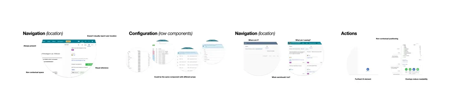
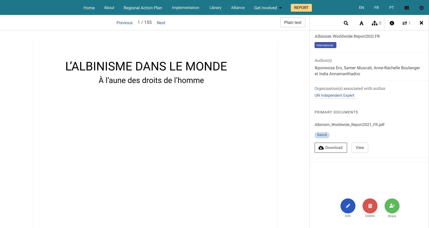
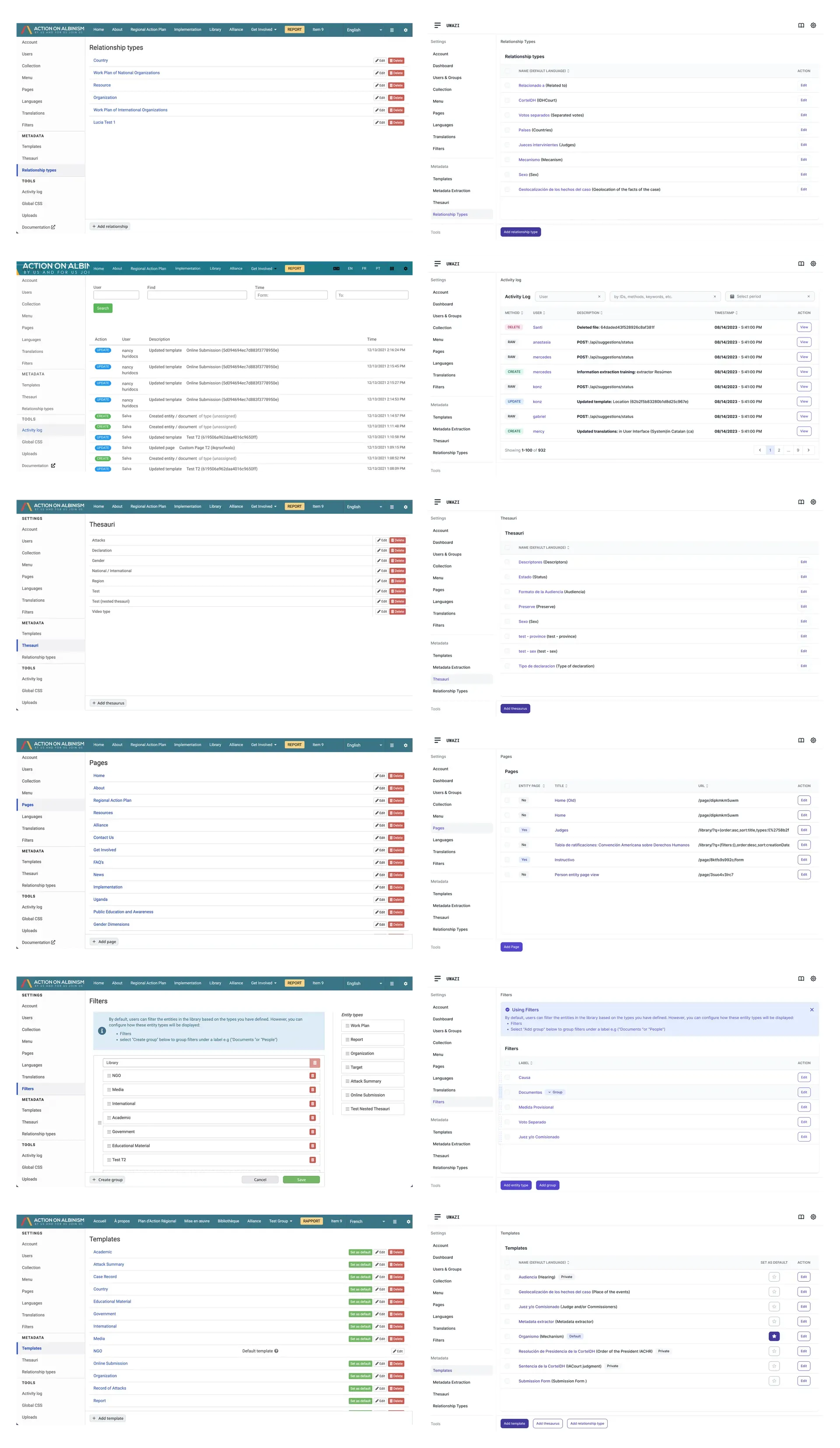
So the settings looked nothing like the library. Filters worked one way in one place and another way somewhere else. A table in one section was a list of cards in the next. Nobody could hold the thing in their head, and every new section meant learning the interface again from scratch. For an organization onboarding a team of five, that was the actual barrier, not the concepts.
It also had a cost that is easy to miss: the inconsistency made the platform look less trustworthy than it was. These are people deciding whether to put the most sensitive records they hold into your software. A tool that looks assembled rather than built is a harder thing to say yes to.

Drawing it
I spent months fixing individual screens before admitting that was never going to converge. Every fix made one screen better and the gap between it and its neighbours worse. I took the case for a full rebuild to the CTO, and the version that got approved was the harder one: redesign everything, ship it in pieces, never take the platform down.
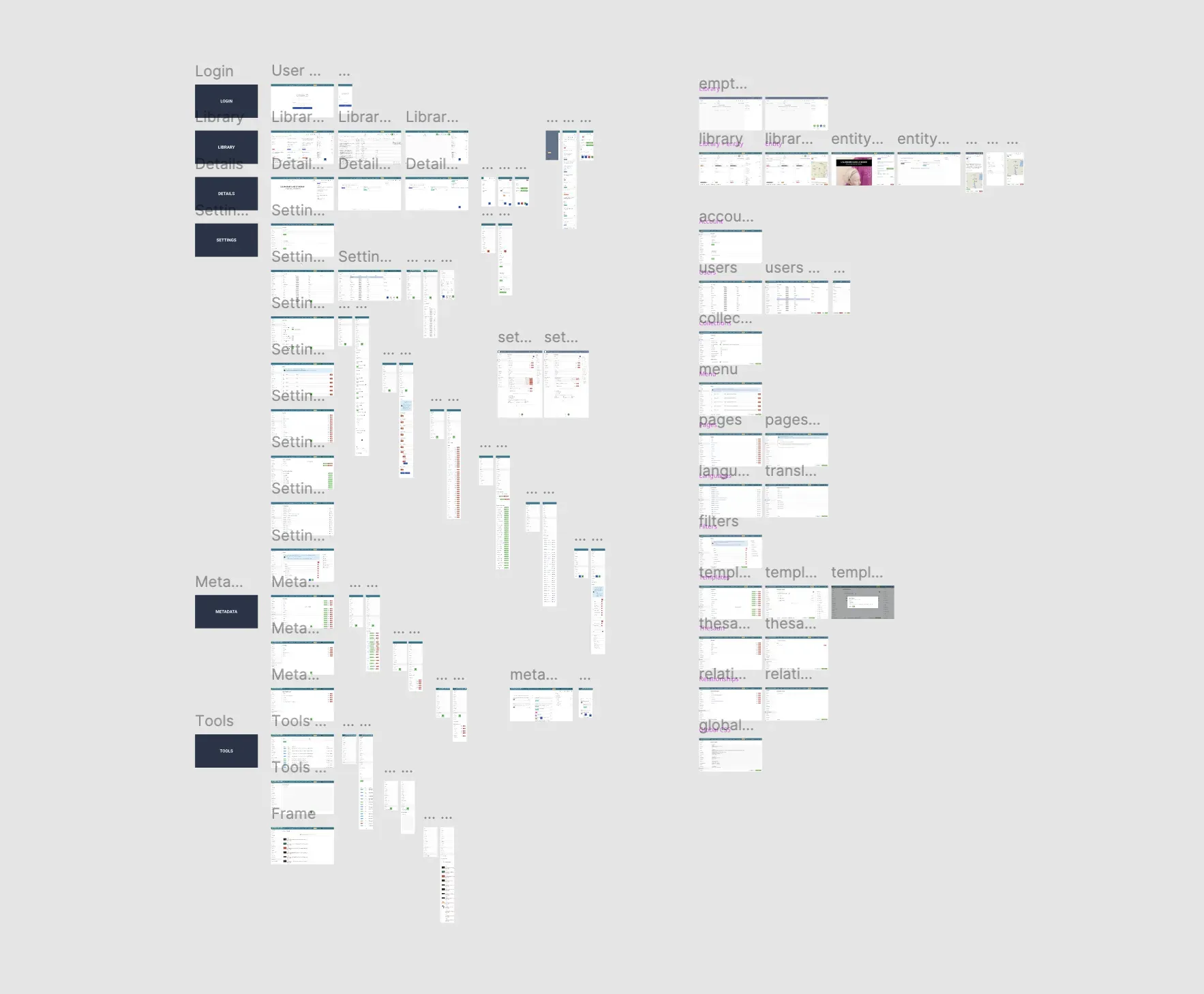
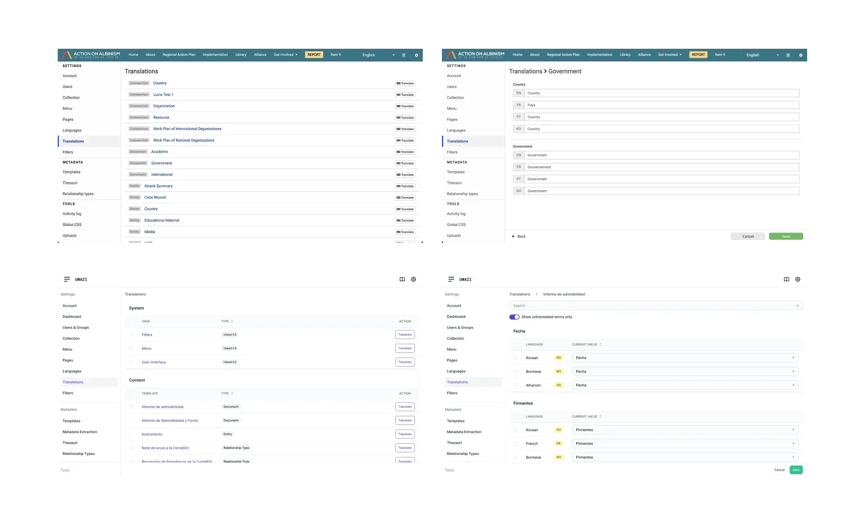
Then I found there was no handover from the previous designer. No Figma file, no source of truth, nothing but the running product. So the first real work was archaeology. I rebuilt every implemented screen, feature, and state in Figma by reading the live interface, which took weeks and was the single most useful thing I did on this project. You cannot argue about inconsistency in the abstract. Once all of it was on one canvas, the argument made itself, and the same file became the map for everything that followed.
Four patterns
The constraint I held to hardest was translating every existing feature one to one. No feature gets dropped, no behaviour gets quietly changed to make the redesign tidier. Organizations had built their working practice on this software, and a redesign that also moves the furniture is not a redesign, it is a migration nobody asked for.
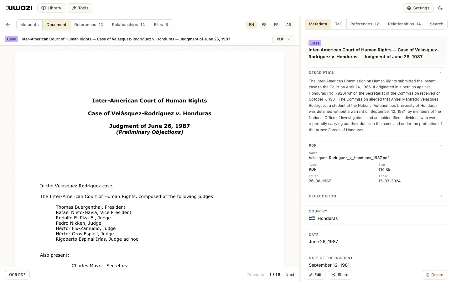
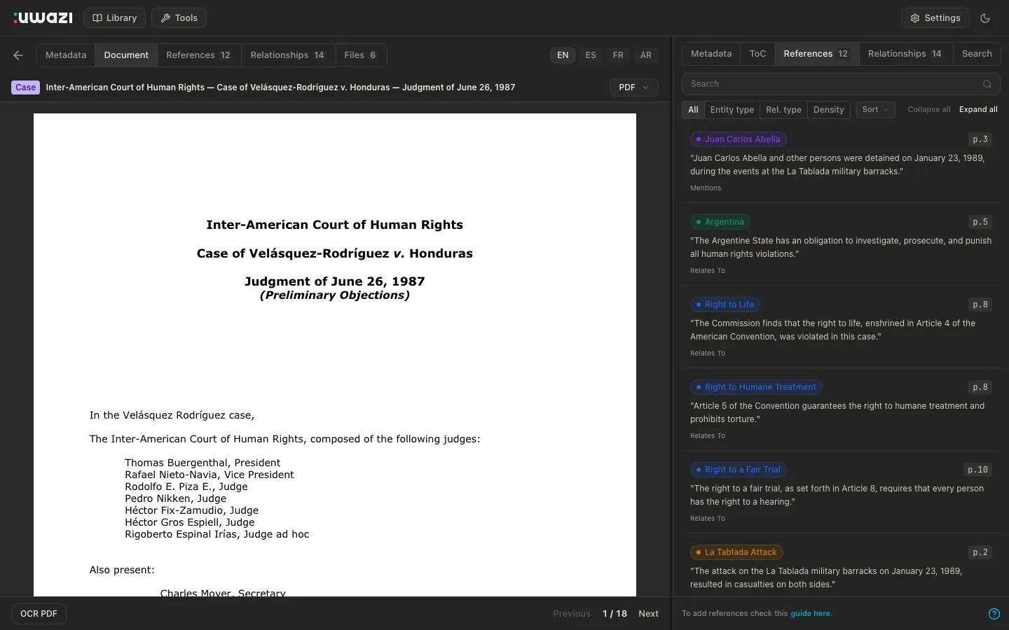
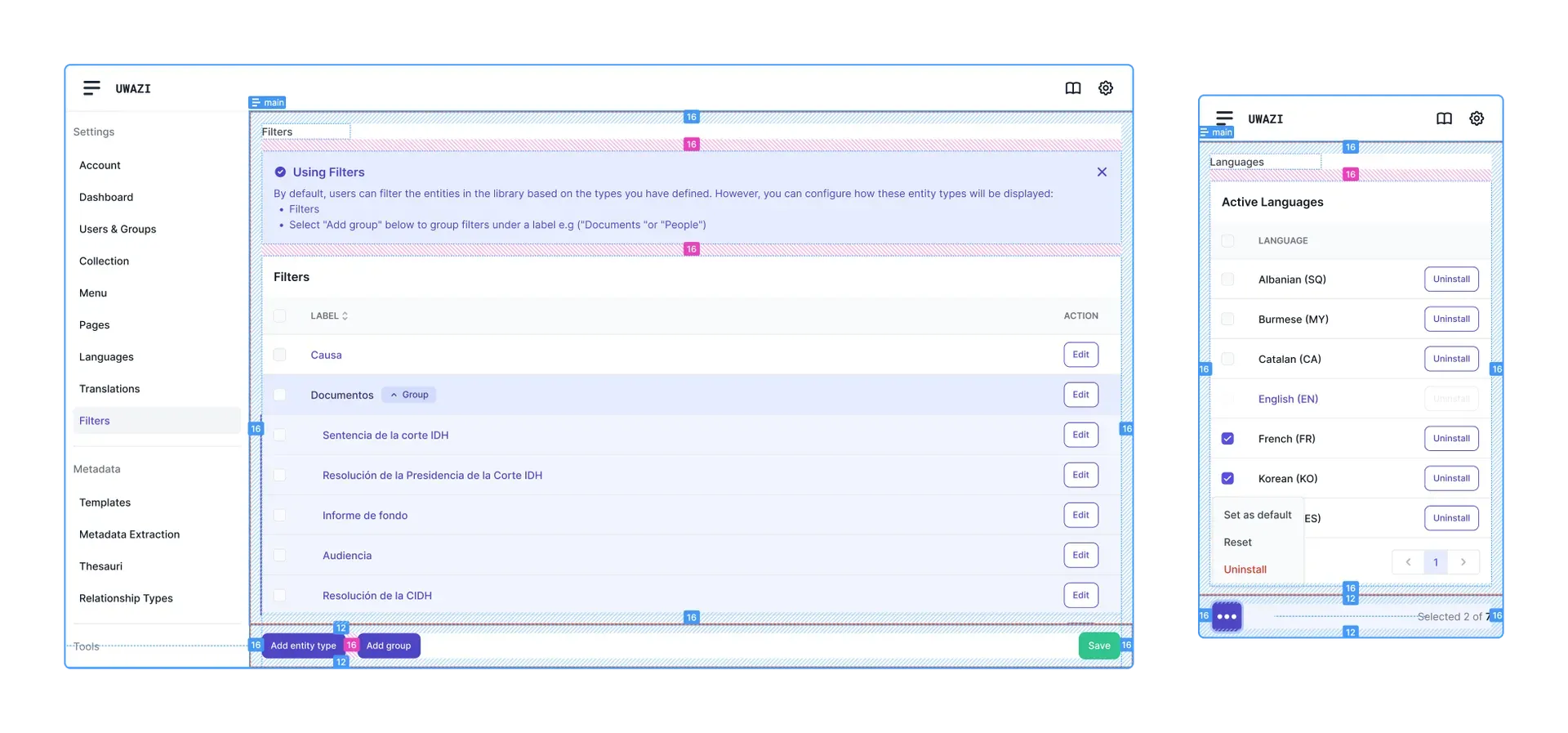
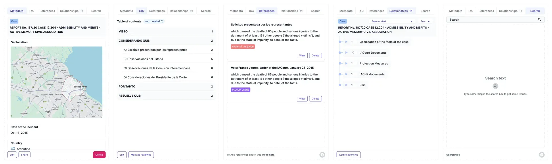
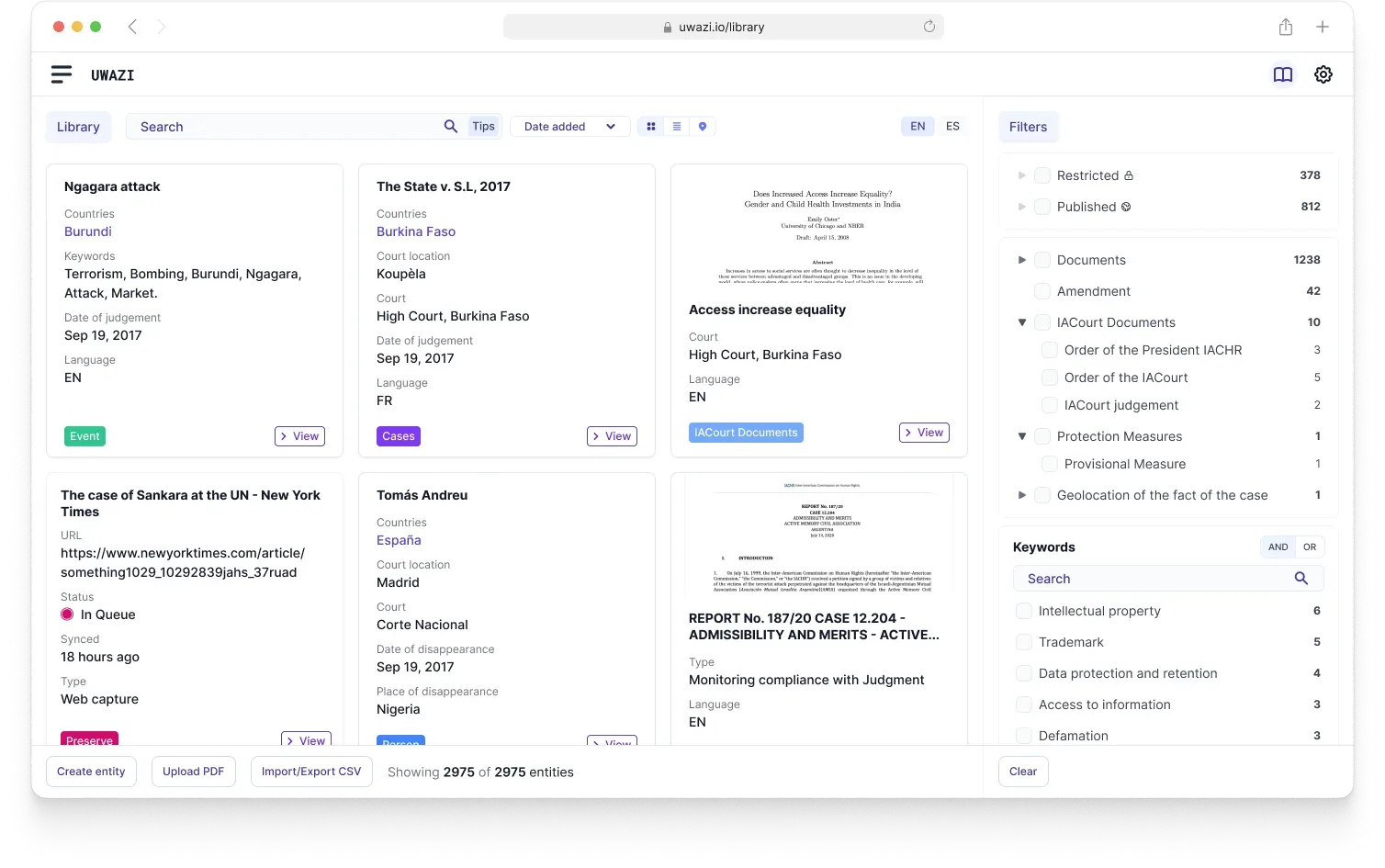
Within that, almost everything collapsed into four patterns. A table for anything that is a list of things, used everywhere, with no exceptions granted. A drawer for editing one item without losing your place. A stepped modal for the processes that genuinely have stages, so the complexity arrives in order instead of all at once. And a Dynamic Action Bar that surfaces the actions available for whatever you have selected, which removed most of the argument about where to put buttons by answering it once.
Four patterns is not an aesthetic decision. It is the number a small open-source team can hold in their heads and apply correctly without me reviewing every pull request. The design system had to survive being implemented by other people, most of them engineers, some of them contributors I would never meet.
This shipped section by section over eighteen months, into installations where people had live cases open. That rules out the clean version of a redesign, where everything lands at once and the old interface disappears overnight. For most of those eighteen months Uwazi was half redesigned, and the halves had to coexist without either one looking broken.
It also meant no usability lab. Feedback arrived as bug reports and messages from organizations with real work in progress, and I took each section's reception as the test for the next one. Slower than a research round, and impossible to dismiss.
Now
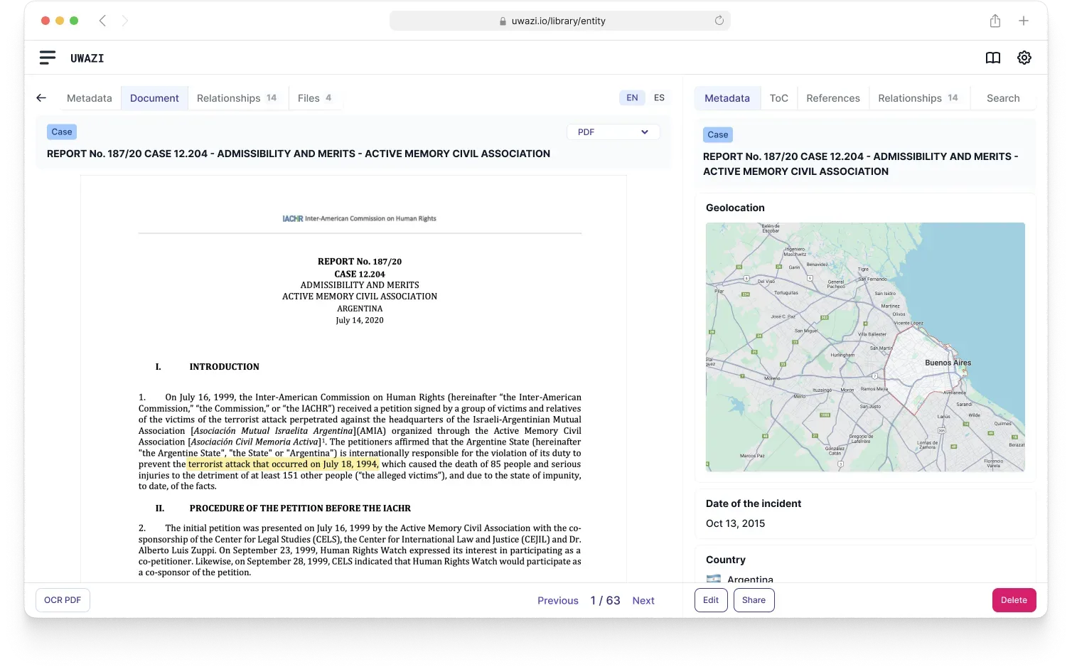
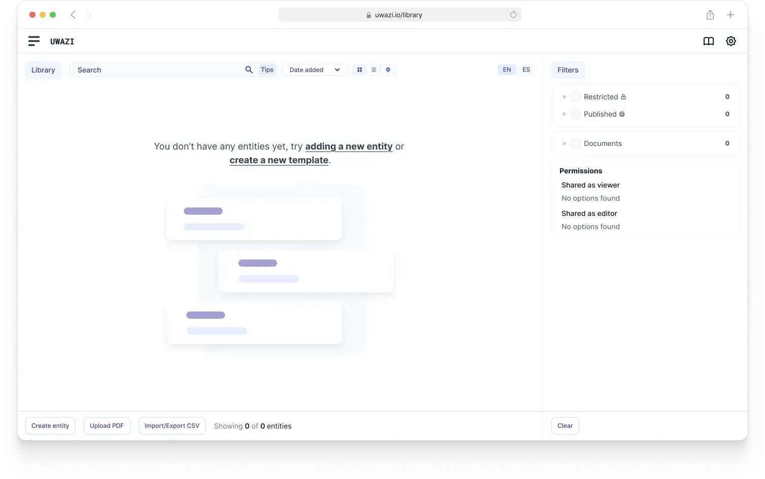
Uwazi is one interface now rather than a dozen. The same table behaves the same way in settings as it does in the library, the same drawer opens for the same kind of edit, and someone who learns one section has genuinely learned the others. The empty states, which used to be blank screens, do the onboarding work that nobody had anywhere to put before.
The outcome I was designing for is quieter than an adoption number anyway: the patterns ship as something a small open-source team can hold in their heads and apply without me in the room, and that is the test the system has to keep passing.
Not a Figma file
The rebuild was not the hard part. Getting agreement to do it at all, and then holding the line on translating features one to one when it would have been so much easier to quietly improve things along the way, was the hard part. Consistency is mostly a political achievement wearing a visual costume.
I also stopped believing a design system is the file it is drawn in. It is however much of the system the people implementing it can remember. Four patterns that get applied correctly beat forty that are documented beautifully and ignored, and that is the measure I have used on every system I have built since.
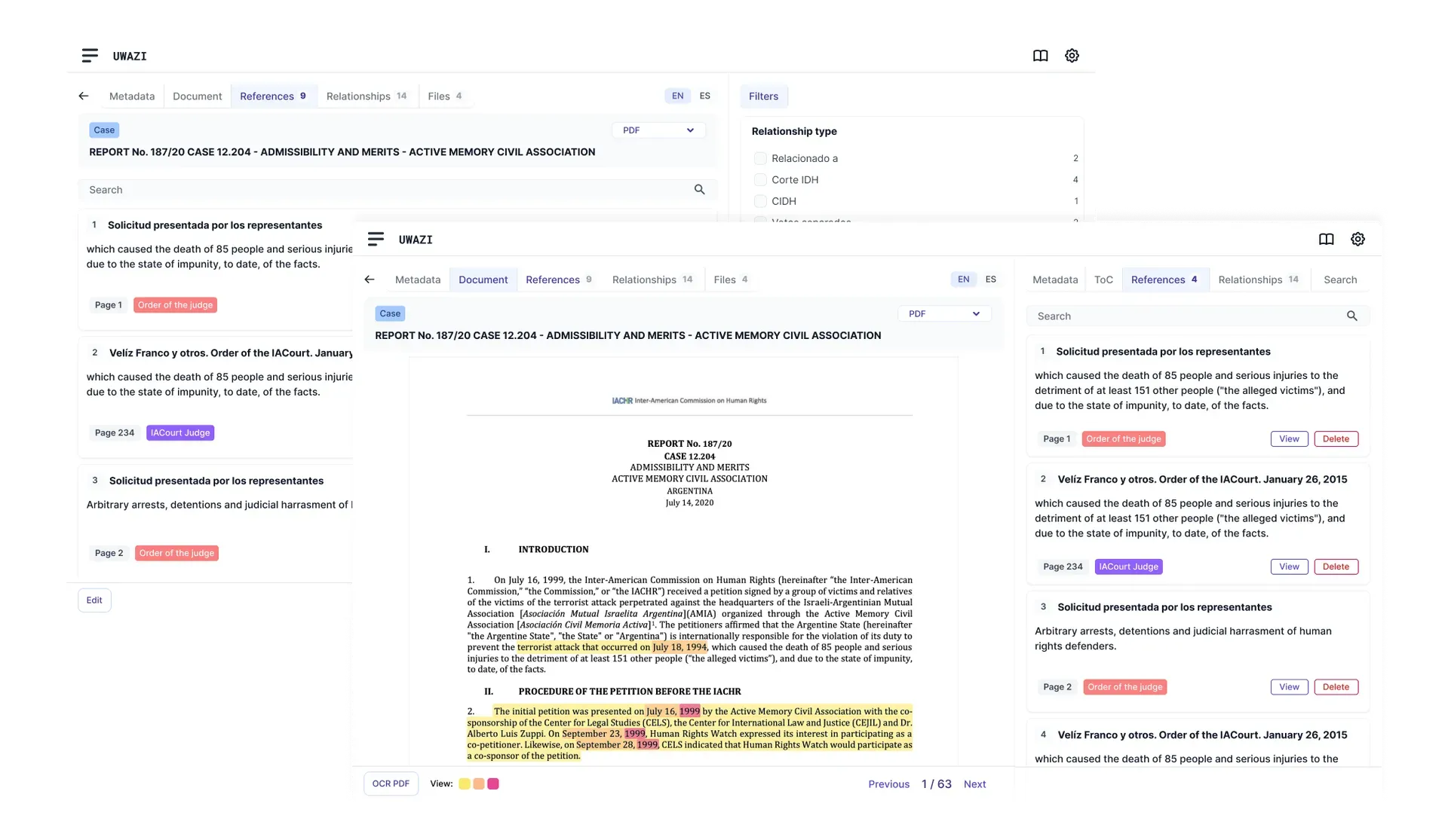
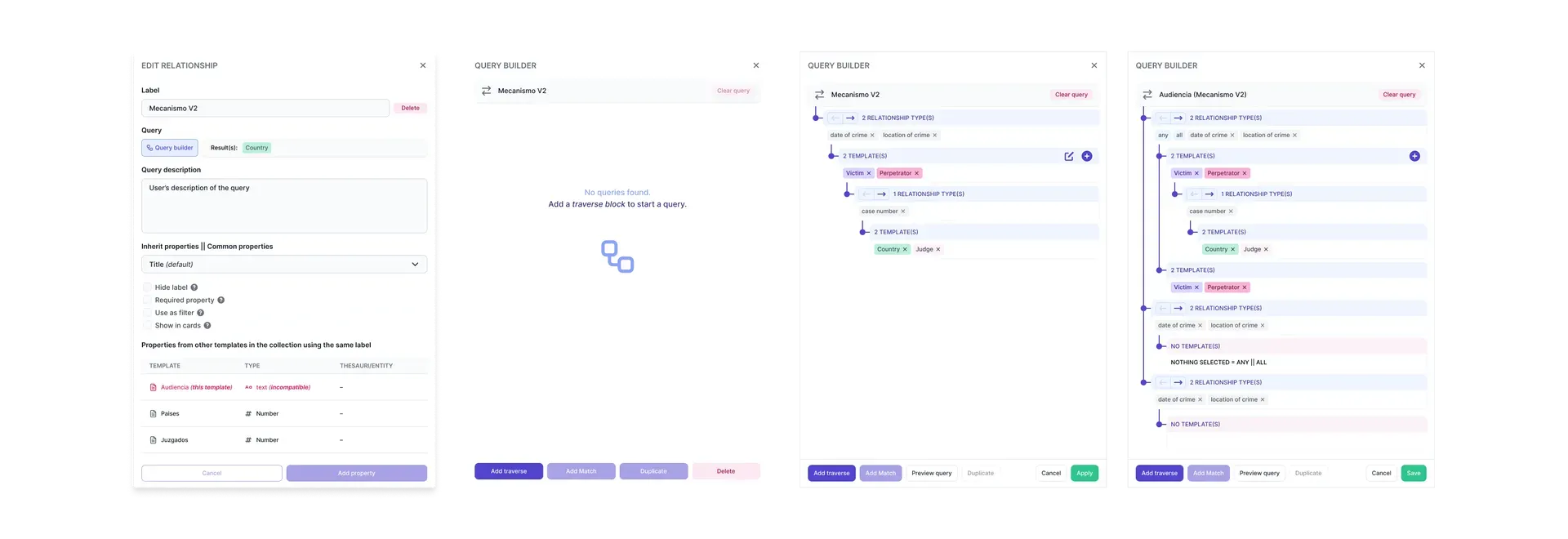
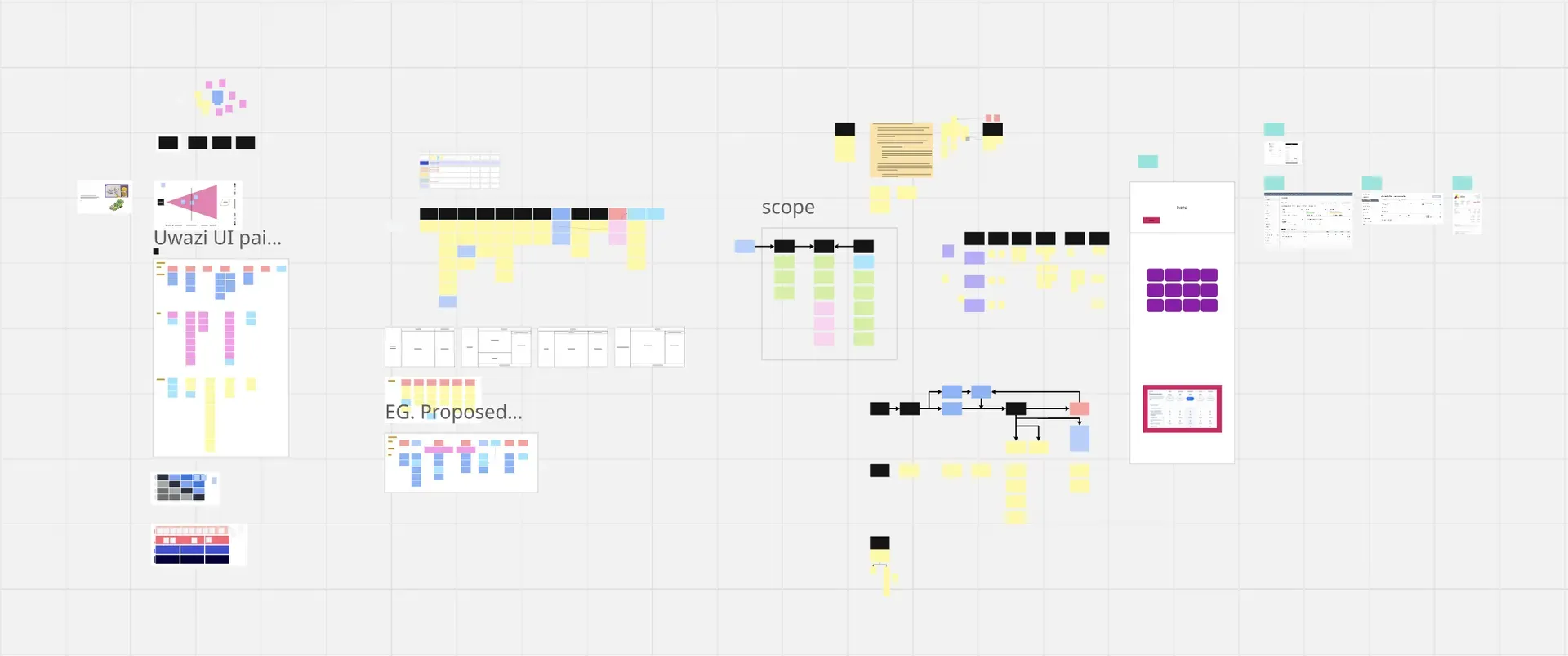
Those last two are concepts, not shipped work. Eighteen months on one platform produces a lot of that: designs for text references that can overlap, a query builder for the second version of relationships, a good deal more that never left Figma. I am showing them because they are where the system was heading, and because a case study that only shows what shipped is telling you half of what happened.