LEVEL 2
REBUILDING THE INTERFACE
UWAZI · SYSTEM CONSISTENCY · HURIDOCS
MISSION BRIEFING
| ROLE | LEAD UX / UI |
|---|---|
| PARTY | CTO + 8 ENG |
| TIME | 18 MONTHS |
| TOOLS | FIGMA / MIRO / TAILWIND |
| STUDIO | HURIDOCS 2021-25 |
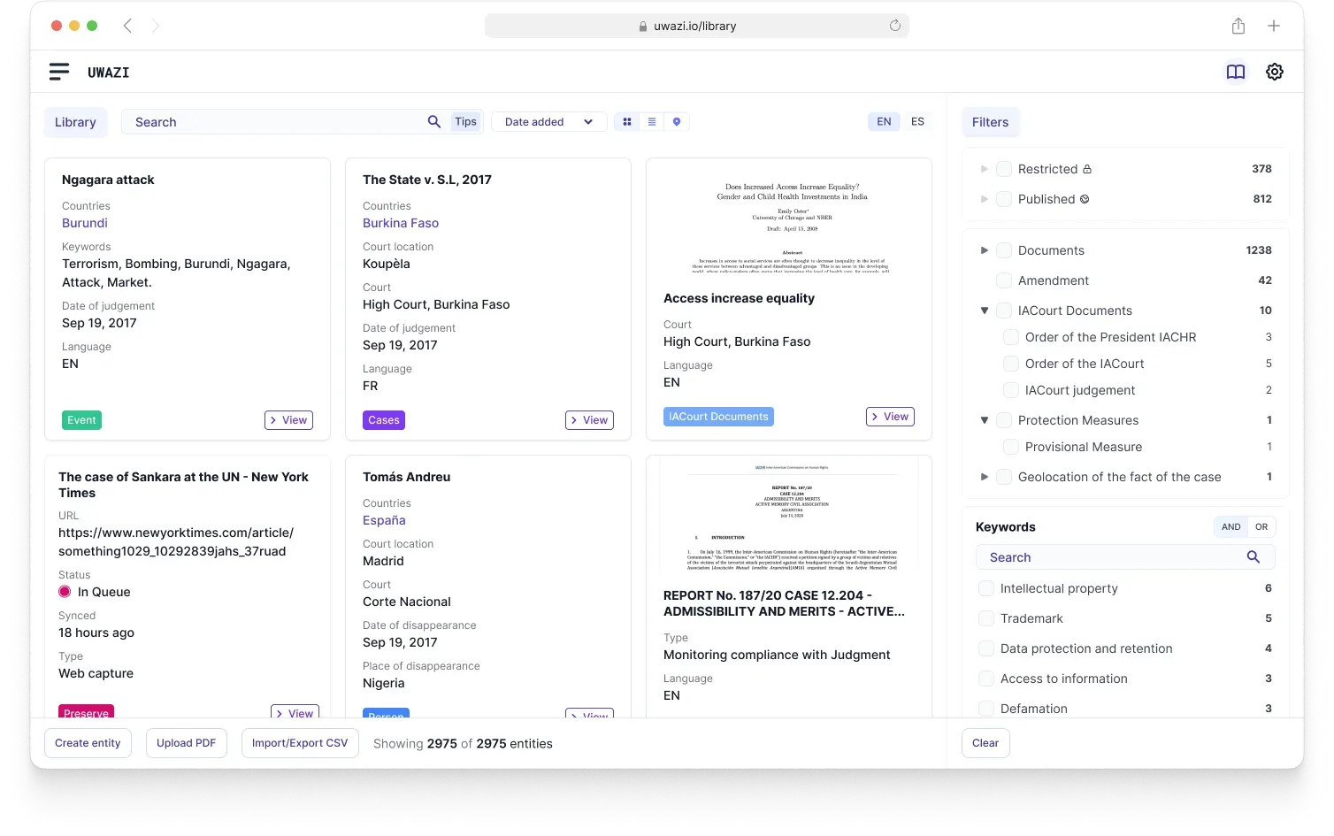
Uwazi is a human rights documentation platform used by 150+ organizations. It grew organically into a patchwork of inconsistent interfaces and fragmented flows, so I rebuilt the UI from scratch and gave the whole platform one design system.
STAGE 1
THE CHALLENGE
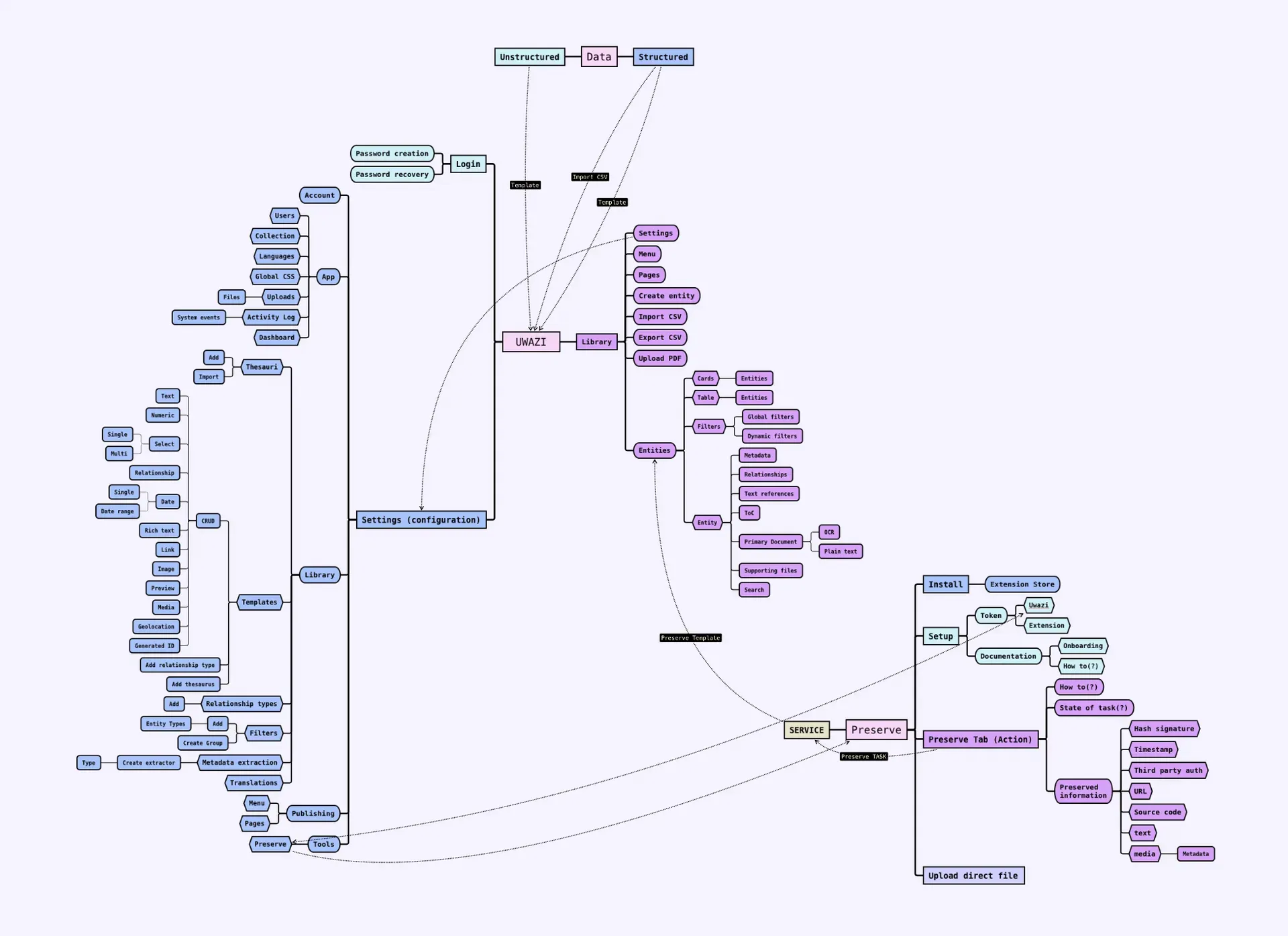
Years of focused fixes had piled up into conflicting navigation, clashing visual hierarchies, and interactions that changed from one section to the next. Every new feature meant relearning the interface.
That inconsistency taxed everyone. New teams struggled to onboard, experienced users burned energy context-switching, and the friction pulled focus away from the actual human rights work.
STAGE 2
RESEARCH
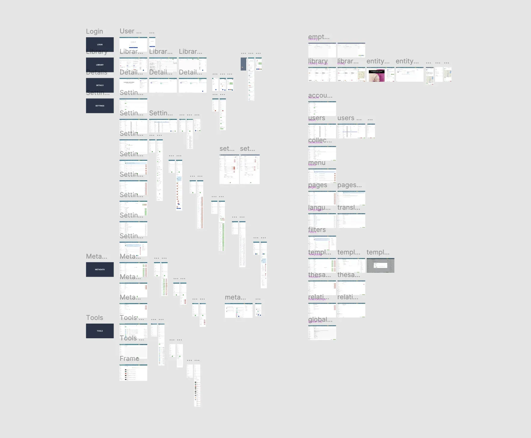
The team agreed it was time for a full overhaul: rebuild the UI and roll it out incrementally, all on a unified system. There was no handover from the previous designer, so step one was recreating every live screen and state in Figma before anything could move.
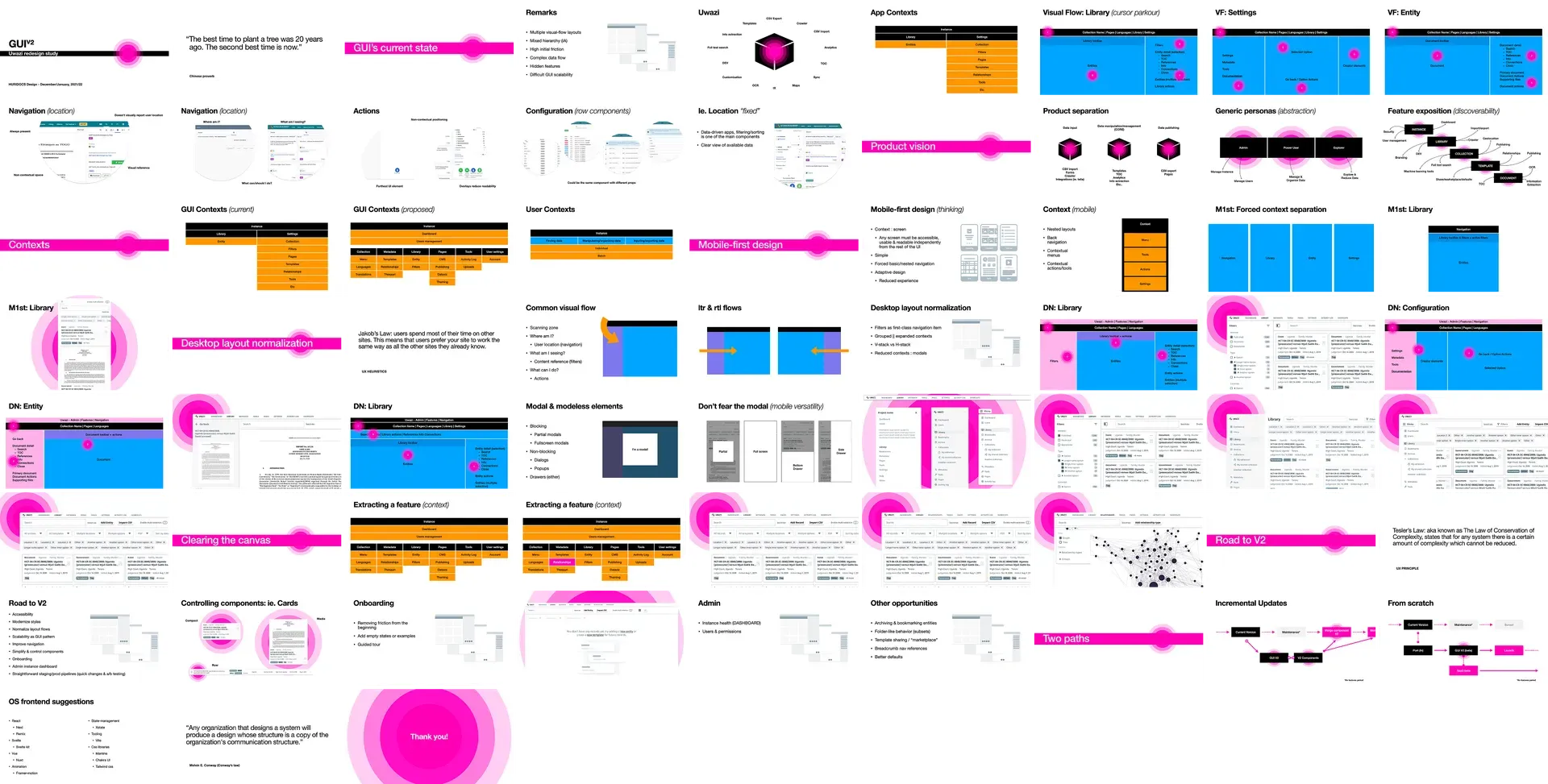
- User feedback showed the gap between expectations and reality.
- Competitor analysis surfaced best-in-class usability patterns.
- Journey mapping traced the most frustrating paths.
- Personas pinned down the core user types and their needs.
STAGE 3
DESIGN
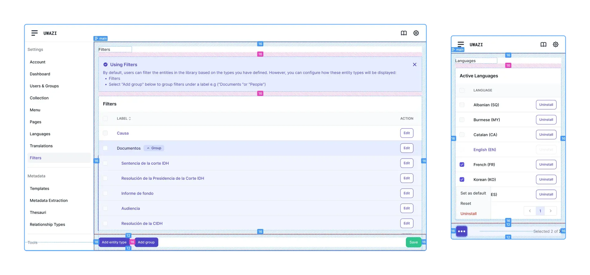
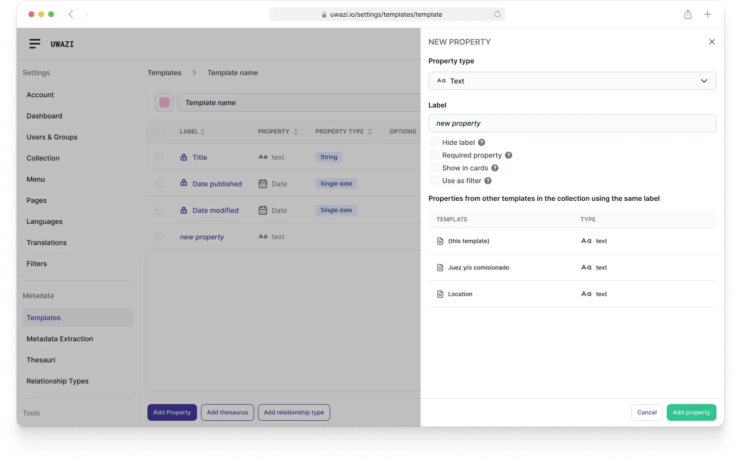
One principle drove it: aggressive simplification. Break complex work into clear stages, cut cognitive load, and design out errors. The system introduced a table-based UI, focused drawers, stepped modals, and a Dynamic Action Bar that surfaces the right actions in context.
- Translate every existing feature 1:1, killing bugs on the way.
- Smooth the handoffs between key workflows.
- Unify and standardize reusable components.
- Build a design system that scales to future features.
THE SYSTEM
STAGE 4
TESTING
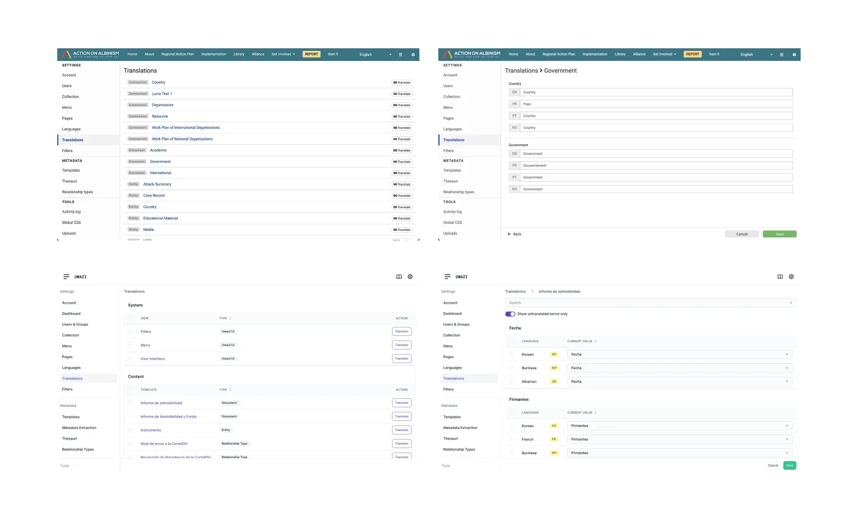
No lab, real usage. We shipped in iterative releases and tuned each one against how organizations actually manage documentation, holding the platform stable for the teams depending on it every day. Old versus new, side by side, until the new pattern won.
BOSS DEFEATED
IMPACT
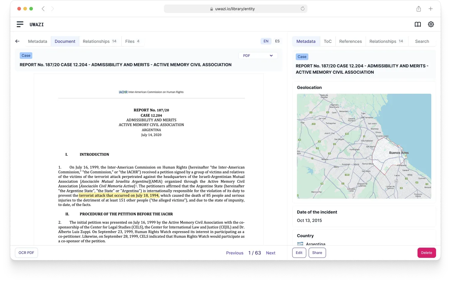
- Intuitive navigation and predictable, standardized flows.
- Onboarding got dramatically easier for new organizations.
- Existing users moved faster with less cognitive load.
- Reusable components replaced one-off, inconsistent screens.
- A foundation that adds features without redesigning the base.
STAGE CLEAR
Redesigning a system people depend on daily rewards gradual, user-centered change over a big-bang rewrite. The design-system foundation now carries new features on the cohesive experience users expect, and will for years.